
Responsive Screen Devices - Web Mockups
Gallery:
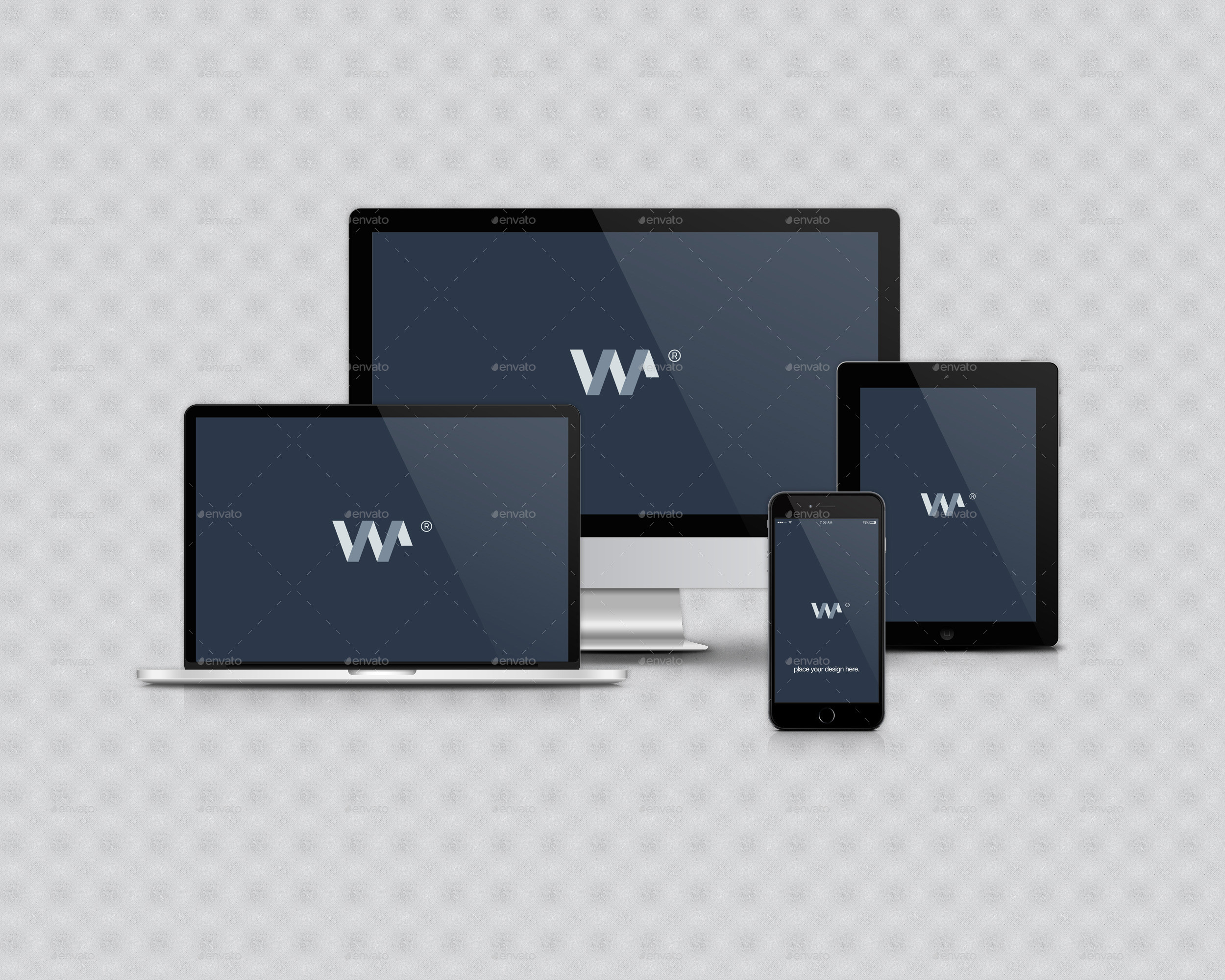
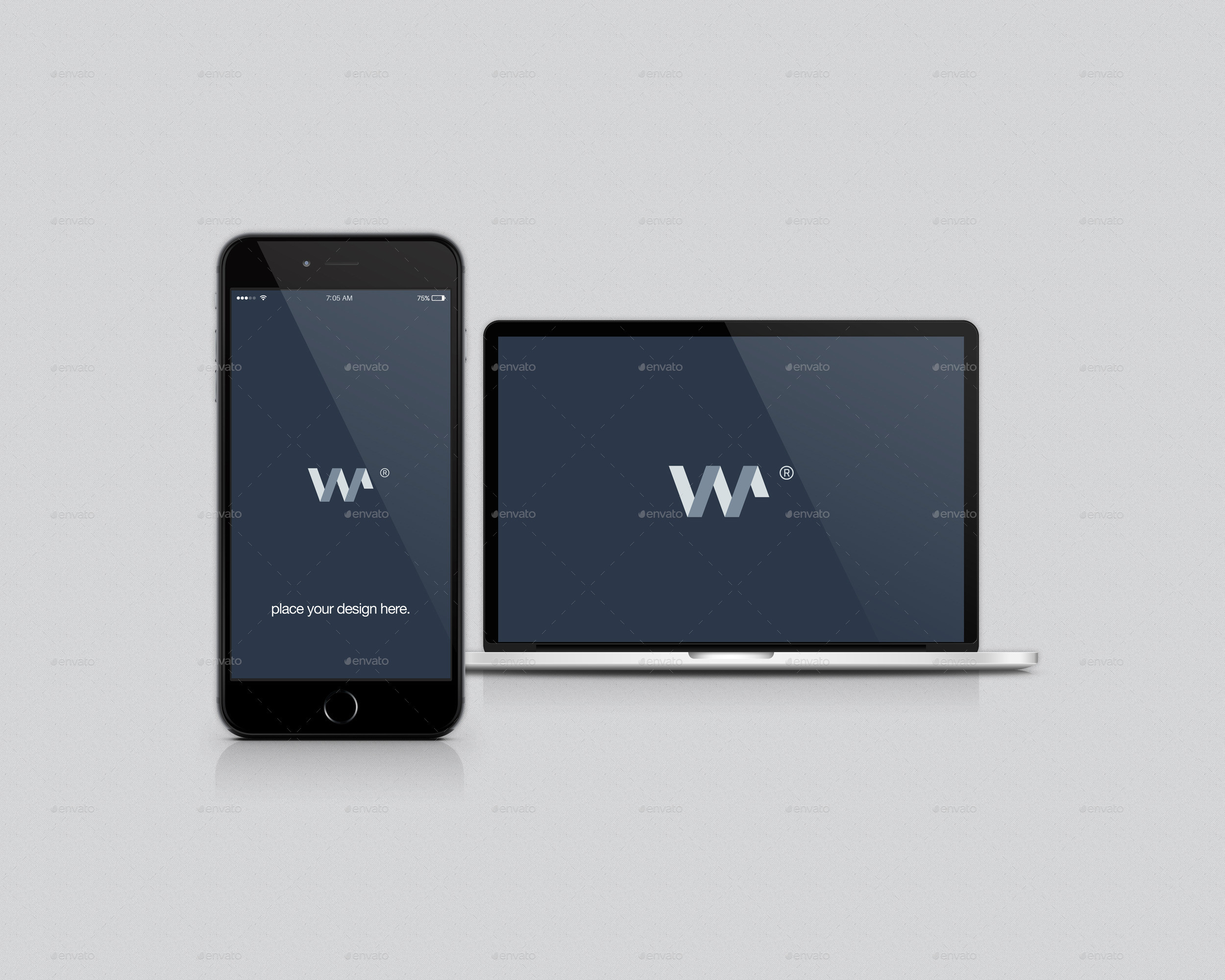
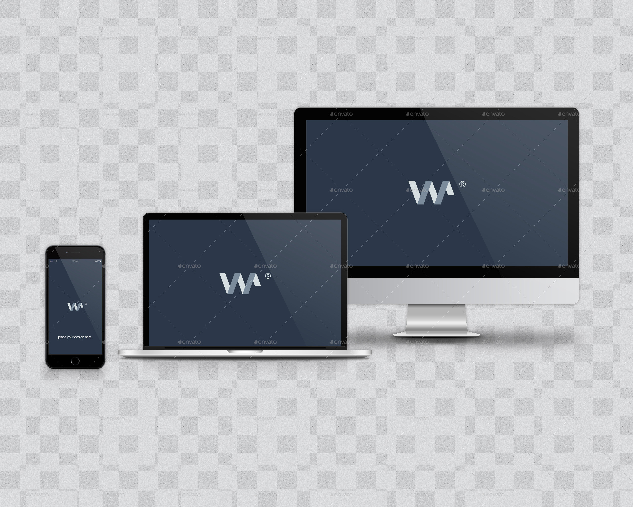
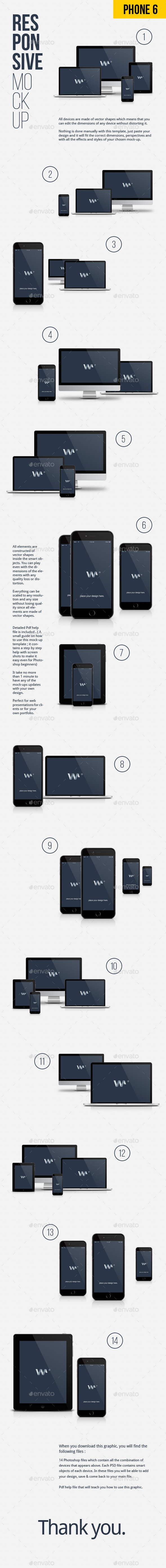
All devices are made of vector shapes which means that you can edit the dimensions of any device without distorting it.
Nothing is done manually with this template, just paste your design and it will fit the correct dimensions, perspectives and with all the effects and styles of your chosen mock-up.
All elements are constructed of vector shapes inside the smart objects. You can play even with the dimensions of the elements with any quality loss or distortion.
Everything can be scaled to any resolution and any size without losing quality since all elements are made of vector shapes.
Detailed Pdf help file is included . ( A small guide on how to use this mock-up template ; it contains a step by step help with screen shots to make it easy even for Photoshop beginners)
It take no more than 1 minute to have any of the mock-ups updates with your own design.
Perfect for web presentations for clients or for your own portfolio.
Responsive Screen Devices - Web Mockups
Gallery:
Similar graphics:
Responsive Screen Devices - Web Mockups
Gallery: