


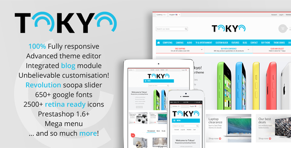
Tokyo built on Bootstrap for Prestashop 1.6
Tokyo is a fully responsive, clean & flexible theme with an integrated blog. Our amazing template comes jam packed with additional options, styles and modules. We’ve made sure every page looks stunning.
The perfect choice whether you are a developer or someone setting up a store for the first time. Everything is easy to use and well documented, so you will be set up and running in no time. Make changes with ease from our powerful theme editor module, you don’t need to touch any code to make a unique site.
Suitable for any type of store; fashion, electronics, gift, food and many more!
Need any help? We are armed with our FAQ’s and support ticket system to get you help as quickly as possible.
Compatible Prestashop: 1.6 – 1.6.0.6


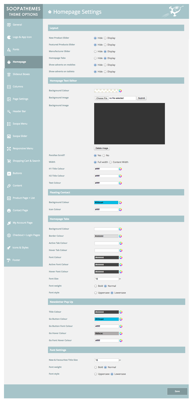
Tokyo is 100 % responsive and comes with integrated retina ready icons. The theme has been created to support all screen resolutions to ensure a perfect looking store on any device. Complete with device specific settings, giving you full control over what to display on the mobile and desktop versions, with a simple click in the theme editor. Eg. Soopa Slider off – mobile, on – desktop.


Change practically every design element of your store with our easy to use powerful theme editor. From colours, font sizes & styles to patterns & backgrounds, you can even use your own custom image, all without touching a single piece of code, HTML or CSS.
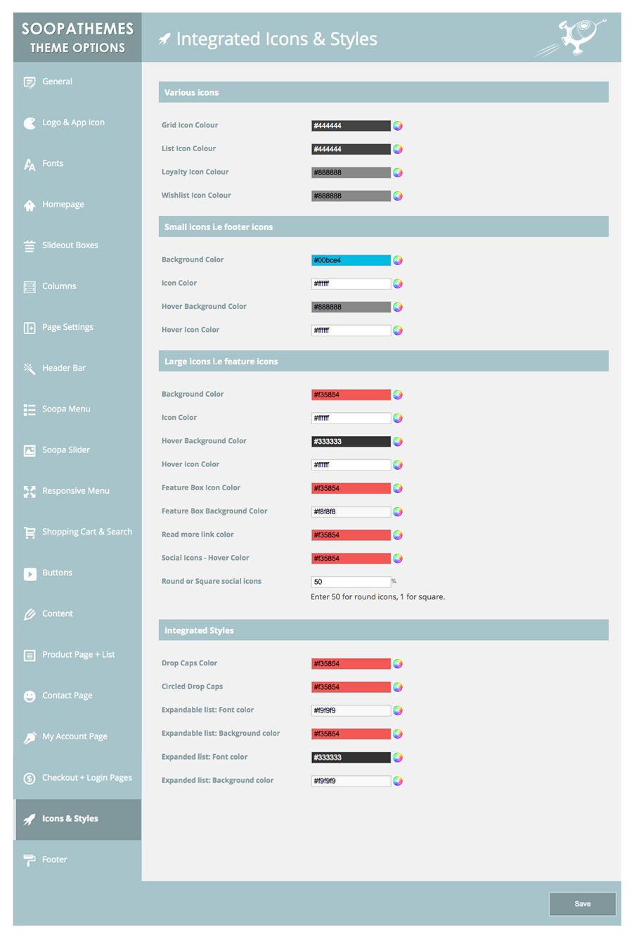
Complete with over 650+ Google fonts, 2500+ icons and integrated styles, you can create a unique store in no time.


Tokyo features an extensive soopa menu module. Allowing you to create eye catching menus with flexible navigation. Choose from 1-6 columns, add links to any page, products or any where in your store. Soopa menu also enables you to add images and HTML content.

 | Soopa Slideshow Responsive, Customisable & Easy !
The theme comes with a highly flexible
slideshow. You can choose full width, fixed
width and set to any height you like
Add a background image, text, images or
video then add animation & effects. |
Integrated Blog
Keep your customers informed with our beautifully styled integrated blog. Choose to display recent posts on your homepage, and have a dedicated page for all your store’s blog posts.

Google Snippets
Google Rich Snippets, give you visually enhanced results on Google’s search engine. They are extra bits of text that appear under search results. Think of them like bacon bits for search engines. An extra pop of flavor that differentiates you from the plain old potato next to you and helps you to increase store visitors.


DESIGN
-
Fully customisable - control the look of every aspect of your store. Extensive theme editor lets you control the colour style fonts etc. See all customisable features [view all]
-
Unlimited colours – change virtually every colour option in your store
-
Google fonts – choose from over 650 google web fonts
-
Retina ready icons – comes packed with over 2500 icons
-
Fully responsive – responds to the screen resolution, works on all desktop and mobile devices.
-
Parallax image scrolling – unique image scolling for an eye catching store
-
Backgrounds – choose from a range of patterns, colours or upload a custom background image
-
My accounts page – completely customisable my accounts page
-
Custom login page – upload your own background image for a unique and stunning effect. Includes the option of a parralax scroll effect
-
Floating contact – add a floating tab to the side of your page, useful for contact/social/advert
MEGA MENU
-
Menu styles – packed with a mega menu that allows you to add a completely custom menu to your store. Add links to any categories, products and CMS pages
-
Custom content – make your site stand out by adding custom content, links and images
-
Fully customisable – change the colour of text, backgrounds, hovers & drop-downs
-
Accordion (alternative menu) – a separate menu for mobile optimisation
HOMEPAGE
-
Soopa slideshow – fully customisable & easy to use. Add a background image, text, images then add animations and effects. On/off for mobile
-
Blog – add blog posts to your homepage. Keep your customers informed with a store blog
-
Slide Out Boxes – add custom content to your store with these handy slide out boxes
-
Advert banners – comes with the option to add a series of adverts/banners under the slideshow
-
Parallax content area – choose to set a background image, add text & additional images
-
Brand / Manufacturer slider – choose to display your stores brands on the homepage
-
Mobile slideshow – ability to remove slideshow on mobile devices and replace with alternative mobile optimised slideshow
-
Product hover effect – assign a different colour skin on hover to make them stand out
-
Product hover – display details and a second image on hover. Or simply
remove if preferred -
Featured product slider – display featured products on the homepage. New/Sale graphics, plus alternate image and actions on rollover
-
New products slider – display new products on the homepage. New/Sale graphics, plus alternate image and actions on rollover
-
Newsletter / advert pop-ups – grab your customers with a newsletter or advert pop up
-
Cookie control – comply with EU cookie law with ease
-
Homepage layouts – choose between product sliders or custom tabs
-
Ajax search with images – Interactive autofill search function with linked images
CATEGORY PAGES
-
Grid / list view – London comes with the option to display your items in either list or grid view
-
Custom content – make your site stand out by adding custom content, links and images
-
New & sale – display eye catching labels in any colour and position
-
Category image – full width or fixed width, can be displayed on both category & product pages
PRODUCT PAGE
-
Image gallery – display alternative pictures as thumbnails which can be enlarged to show your customers more
-
Brand / Manufacturer logo – display your products brand/manufacturer logo in your product page. Brand is linked to alternative products.
-
Product zoom – allow your customers to take a closer look at the product
-
Product image gallery – enable/disable gallery mode in the Lightbox (previous/next buttons)
-
Customer reviews – a totally re-designed review section, with a more prominent position
-
Custom table – add as many additional info tabs as you like, unique content for each product
-
Product sliders – for items in the same category, related/accessories etc. Mobile touch enabled
-
Product swatches – look like a pro with our improved swatch rollover effect
-
Slideshow advertisements – Display a mini slideshow in your left column, perfect for adverts
-
Category image – can also be displayed on product page
-
Previous / next buttons – navigate through products with ease
ADDITIONAL FEATURES
-
IOS icon – customers can add your store icon to their home screen
-
Easy footer – add info, links & images from a CMS layout. Add as many blocks as you like
-
Twitter integration – add your Twitter username and your recent posts will scroll in the footer
-
Updated compare function – tacky tick boxes are a thing of the past with the London theme
-
Wishlist – styled add to wishlist confirmation
-
Product actions – quick view, compare and wishlist animations on hover
-
Add to cart – improved cart notifications, gives your site a ‘classy’ professional look
-
404 page – totally revamped 404 page, no boring image here
-
Integrated styles & layouts – Use predefined styles & layouts to customise your site [check them out]
-
Email templates – completely re-styled automated emails
-
Sticky header – choose between a standard or ‘sticky’ header
-
Google rich snippets – allow you to turn your regular search engine results into visually enhanced, eye-catching results
-
Social login – login with your social login details
Theme Updates
All future updates are totally free of charge. Improvements & bug fixes are guaranteed!
Theme Package
-
Well documented user guides - extensive Prestashop theme documentation including separate theme editor documentation
- PSD files (layered homepage, full screen footer backgrounds, layered smart object graphic)
-
Clean commented code, developer friendly
- Cross browser compatibility
- Please note: Images used in our demo site are not included in the theme package

We offer great customer support through our ticket support service. In order to use this service you will need to register with your Item Purchase Code. This is available from your downloads section on envato.
Be sure to check out our faq’s section we may already have an answer for your question.
Please note: We do NOT provide support in the comments section of ThemeForest
We offer support to our customers Mon-Fri 9:00am-6:00pm (GMT) We are a UK based company. We reply to all questions within 24 hours where possible..
Revisions
Version 1.3 17th June)
Fixed: Safari display issue.
Fixed: "Was" showing on none sale items.
Fixed: CCC for CSS and JS display issue.
Fixed: Soopa Menu not deleting tabs properly.
Updated: Latest version of Revolution slider module.
Added: Social login module.
Version 1.2 (14th May)
Fixed: Few bug fixes
Version 1.1 (25th April)
Fixed: Few issues with icons.
Update: Responsive layout.


